New Year, New You! Time to do a little bit of sprucing up in every aspect of your life, including your home…why not include one of 2017’s colors of the year in your redecorating plan? The Pantone color of the year may be the one you hear about most, BUT Pantone isn’t the only company that releases a color of the year and I’m here to help you figure out what 2017 color of the year is right for you.

The three most popular sources for color of the year in the decorating world are definitely Pantone, Benjamin Moore and Sherwin Williams. The 2017 color of the year from each of these outlets are really different, while Pantone went with a bright green shade, Benjamin Moore and Sherwin Williams decided on more muted neutrals. Scroll through to see swatches of each of the colors and inspiration on how to decorate with them!
The 2017 Pantone color is “Greenery”, it’s a fresh and zesty, yellow-green shade that reminds me of the first days of spring. Leatrice-Eiseman, executive director of the Pantone Color Institute said, “it’s youthful hue is grounded enough to be neutral against the many other storied shades we have a history of loving.” I personally LOVE Pantone’s choice for the 2017 color of the year and think it can be incorporated into pretty much anyone’s home.
Growing up my room at my dad’s house was painted a similar shade and it was so fun, I had mostly black wood furniture and gray bedding and it was so me. If you’re not quite ready to paint a room in your home this vibrant shade of green, think about bringing it in through a fabric like curtains, upholstered furniture or blankets. But honestly you can just add a few great plants to your home to literally and figuratively add life to it!
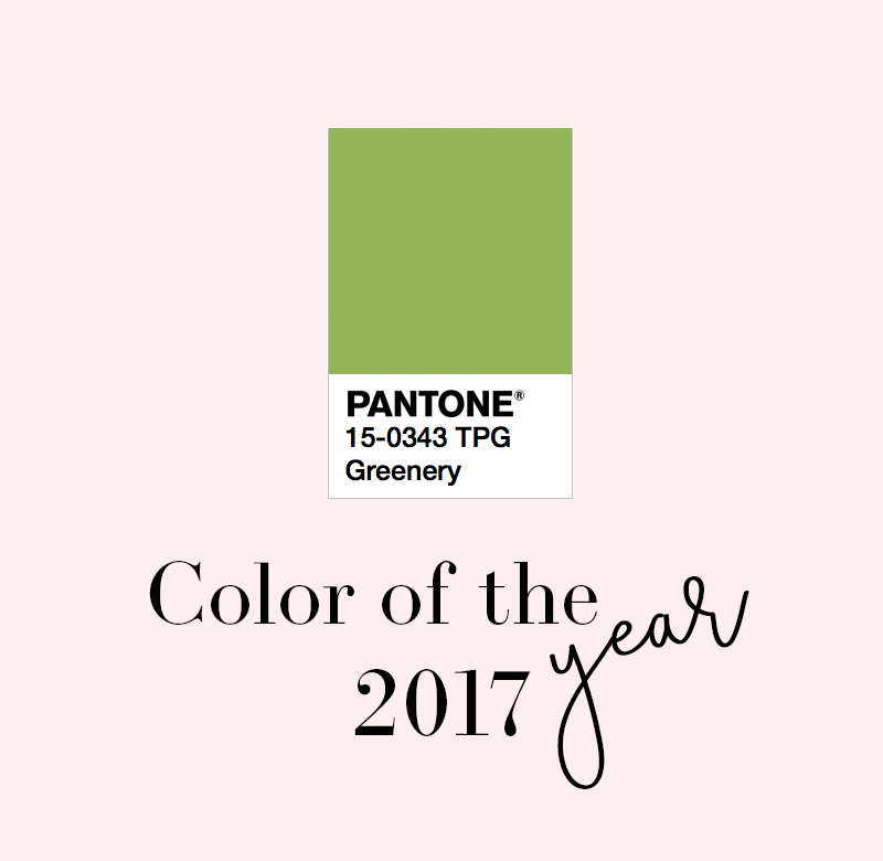
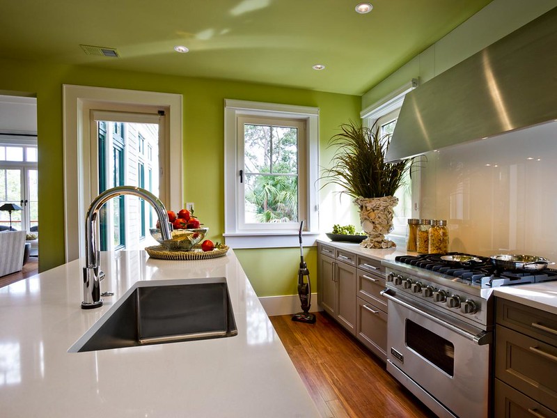 photo via
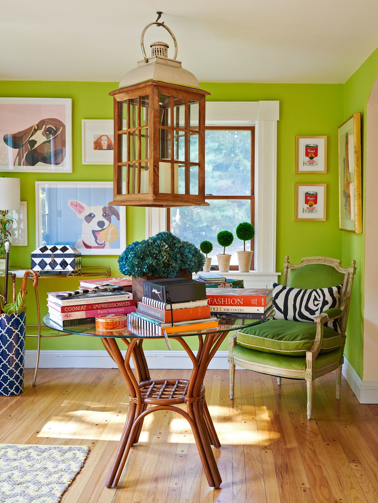 photo via
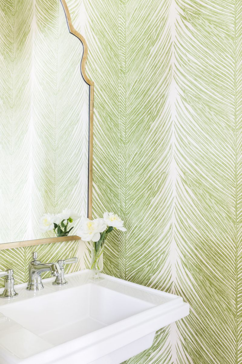 photo via
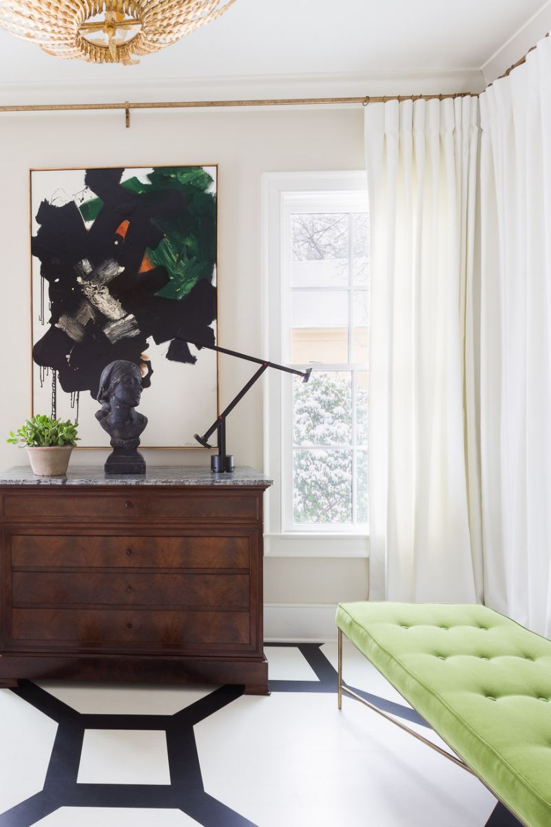 photo via
Shop my favorite green items to add to your home:
Benjamin Moore’s 2017 color of the year is “Shadow,” it’s a rich royal amethyst, that is dramatic, has a smoky hue and can work in many homes. Benjamin Moore director, Ellen O’Neill says “it’s a color that calls to mind a past, yet it can also make a contemporary, color-confident statement. It’s a sophisticated, provocative, poetic and can bring energy to a space.” I’m obsessed with the idea of painting a room in my home a dark color like this. But I know that most people would definitely be hesitant in painting a room in their home this color, especially if you don’t have a lot of natural light. Try adding touches of shadow with throw pillows, curtains and carpeting.
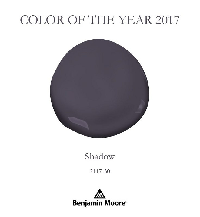
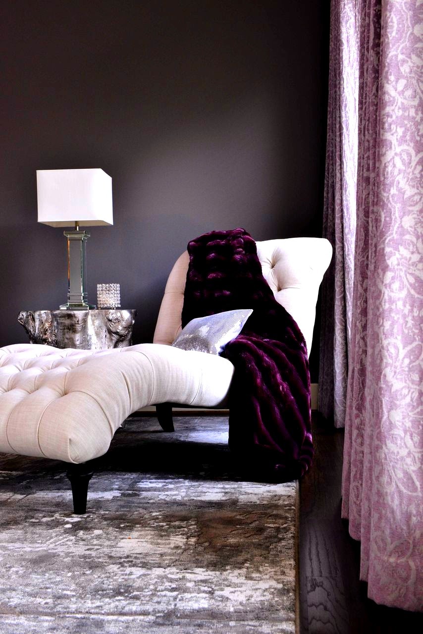 photo via
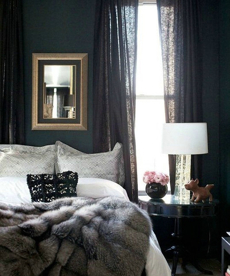 photo via
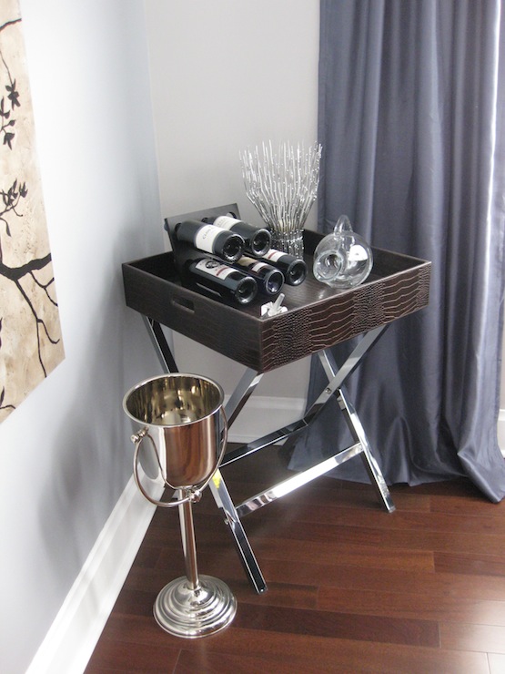 photo via
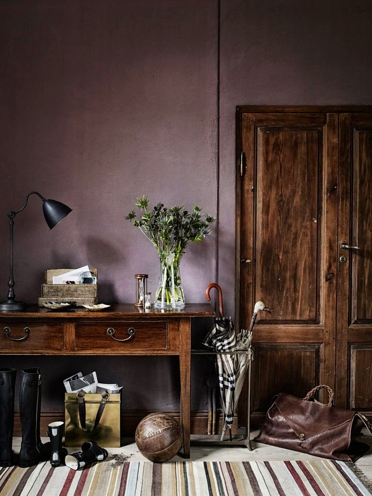 photo via
Shop more shadow items to all to your home:
Sherwin William’s 2017 color of the year in “Poised Taupe,” it’s a timeless neutral. Modern, classic and a beautiful balance of warm and cool. It’s a nice alternative to the color gray that everyone has been using. If the other two colors are a bit too much for you I highly suggest adding a few shades of taupe to your house. Whether you like a more monochromatic look or like pops of color, taupe is a great base color for a room.
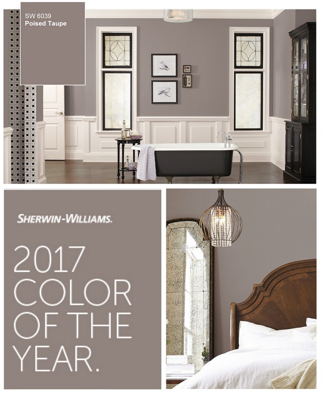
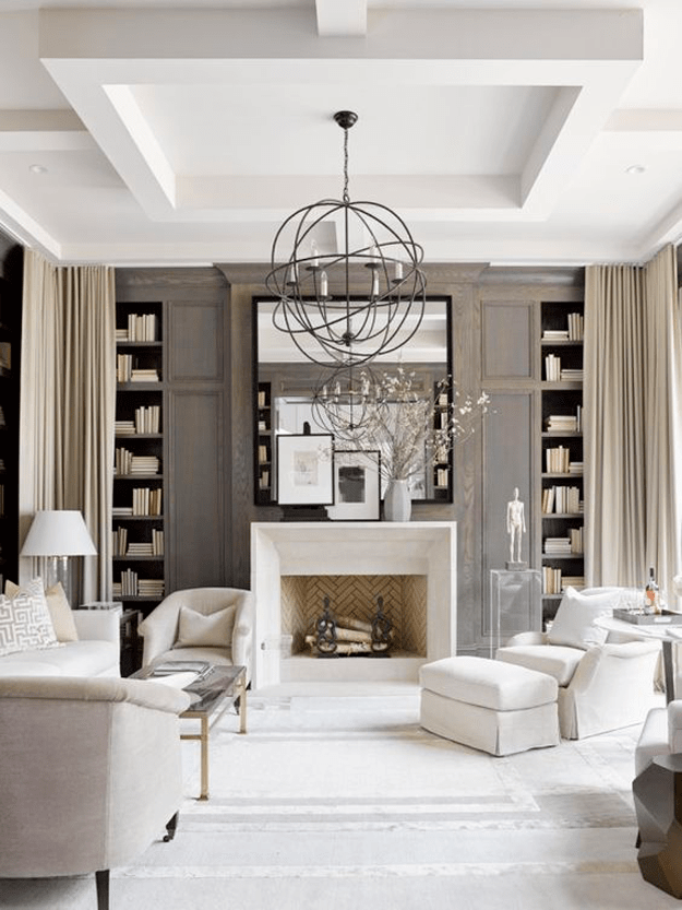 photo via
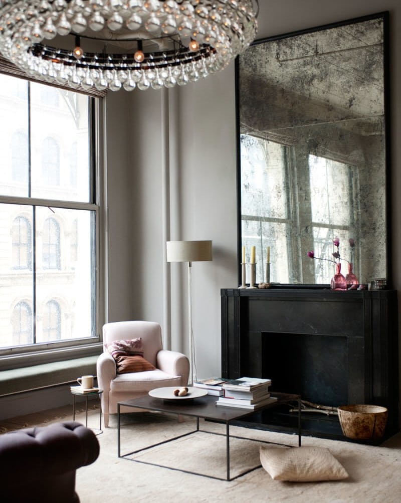 photo via
 photo via
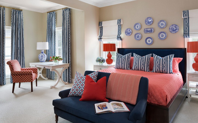 photo via
Shop more poised taupe pieces for your home:
Can’t decide what 2017 color of the year is right for you…why not use all of them? I love how shades of all 3 colors were incorporated into the room below. Greenery on the bed and curtains, amethyst in the art work and taupe on the bedding and carpet. Who knew these 3 colors could look so great together?
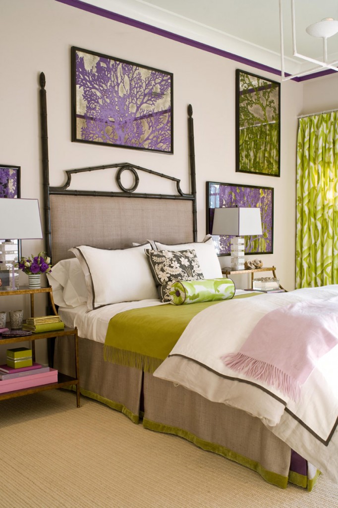 photo via
Now that you’ve seen so many decorating options what 2017 color of the year is right for you?





Leave a Reply